The Sunshine Trap: Why the Sunniest Cities Aren't always the Best Places to Retire

Lima, Peru. Photo by Willian Justen de Vasconcellos on Unsplash.
This is a guest post by Christoph Wackher, who builds GeoRank, a free tool for comparing places to live. His argument in this piece: the annual sunshine-hours figure most of us reach for when judging a city's climate is close to useless. Instead, a measure tracking comfortable outdoor hours is not only far more useful but turns relocation rankings upside down. Over to Christoph.
A better way to measure a local climate
Phoenix, Arizona gets more hours of sunshine than any other city in my dataset. It ranks first out of 478 cities globally, with a total of 3,871 hours of sunshine per year.
In contrast, Seattle gets only 2,164 hours, which puts it 249th, squarely in the bottom half of the ranking. If you had to guess which of the two offers more time outside, most of us would think this is a very straightforward question.
You would be wrong though. Because Seattle gives you 2,600 hours a year that are actually comfortable to be outdoors in, whereas Phoenix gives you 2,372. Yes, Phoenix has 1,707 more hours of sunshine than Seattle, but 228 fewer usable hours. The two facts are not in tension, as I'll explain in this article.
I've spent a while building a dataset of long-term climate averages—what meteorologists call "normals"—for 478 cities around the world, and this is the finding that surprised me most and that I have found hardest to convince people of: across all 478 cities, the correlation between annual sunshine hours and hours that are comfortable to be outside is r = 0.24 (R² = 0.06). That means sunshine only explains about six percent of the variation in outdoor comfort. Ninety-four percent is something else.
If you are choosing where to live and you are using sunshine hours to inform your decision, you're probably using the wrong instrument.
What counts as a comfortable hour outdoors
I will keep this short and come back to the methodological details at the end.
For each city, I take every daylight hour of a typical year and ask whether the apparent temperature falls in a band a person would call pleasant. Apparent temperature combines heat, cold, humidity and wind rather than reading a thermometer. Intuitively, all of us understand that 32°C at 20% humidity is not
the same afternoon as 32°C at 80%.
Then I count the hours that qualify. That is the number.
The dataset does more than total up the comfortable hours. It also attributes every non-comfortable hour to a cause: whether it's too hot, too cold, too wet, or too windy. For any city in the dataset, you can understand how much quality outdoor time you are likely to get and what is taking the rest of it away.
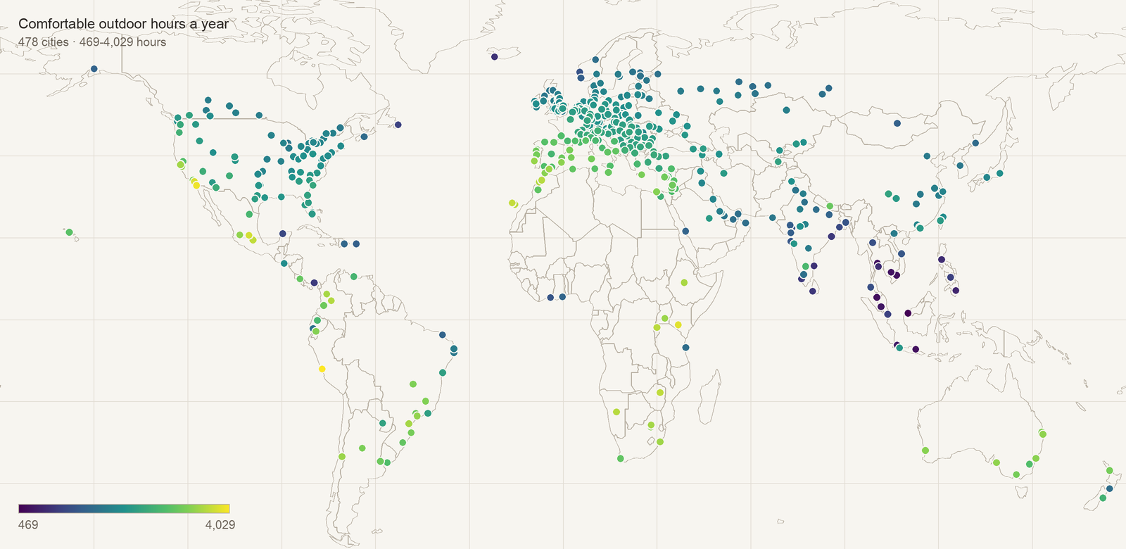
Figure 1: Comfortable hours per year for 478 cities globally from GeoRank.
The “four thieves” that steal your outdoor time
Going back to our earlier example, Phoenix loses 1,682 hours a year to heat. That is the single biggest heat loss of any American city in the set. That single loss explains almost everything about Phoenix. Its winters are magnificent; unfortunately, its summers take much of the outdoor year off the table.
In contrast, Seattle loses 1,621 hours to cold and only 16 to heat. Seattle's reputation is rain, and indeed rain costs it 142 hours. But it's still roughly a tenth of what cold costs it. Seattle's "problem" is not that it is wet, but that it is cool. The rain may be memorable, but it's the chill that actually keeps you indoors.
That pattern holds well beyond Seattle. Across all 478 cities, cold is the largest single cause of lost outdoor time in 310 of them. Heat leads in 156. Rain leads in six, while wind leads in six.
Most people relocating are trying to escape cold, and they are right that cold is the dominant constraint on the planet. The mistake is in the instrument many use to escape it. Sunshine hours do not measure cold. They measure cloud.
Consider three American cities that all get plenty of sun:
| Sunshine h/yr | Usable outdoor h/yr | Biggest thief | |
|---|---|---|---|
| Phoenix, AZ | 3,871 | 2,372 | heat, 1,682 h |
| Denver, CO | 3,094 | 2,417 | cold, 1,653 h |
| Irvine, CA | 2,958 | 3,824 | cold, 249 h |
Phoenix and Denver are nearly 800 sunshine hours apart and land within 45 hours of each other on comfort, for completely opposite reasons. In contrast, Irvine, in Orange County, has the least sunshine of the three and yet gets over 1,400 more usable hours than either. Its sun may be unremarkable by Arizona standards, but it simply never becomes unbearable in either direction: only 202 hours lost to heat and 249 to cold, among the smallest combined losses in the United States.
Irvine is not the sunniest American city, but it's one of the most comfortable ones by a wide margin.
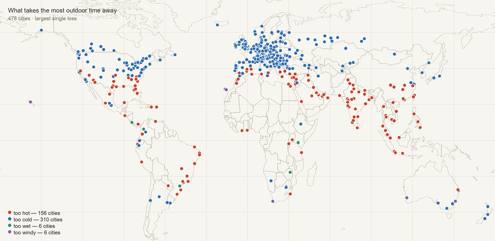
Figure 2. Our “outdoor time thieves” mapped. Too hot, too cold, too wet, or too windy. Source: GeoRank
The most comfortable city on Earth barely sees the sun
If you want the extreme version, let's leave the United States and look abroad.
Lima, Peru, has the lowest annual sunshine total of all 478 cities: 1,165 hours. That is just over half of Seattle's. Lima spends much of the year under a low coastal fog the locals call la garúa, and photographs of it look grey and unpromising.
And yet Lima also has the highest yearly comfortable hours of all 478 cities at 4,029.
Lima sits on a desert coast at 12° South with a cold current offshore, and the result is a city with no extremes in any direction at all. Its whole annual loss is 206 hours to heat, 124 to wind, 57 to cold and 13 to rain. That last figure is less than a single wet weekend anywhere else, and the four together come to almost exactly 400 hours for the whole year. Compare that to Phoenix, which loses 1,682 hours to heat alone.
The fog is doing most of the work. It caps the summer heat, which is why a desert city on a tropical coast tops the list instead of roasting the way its latitude would suggest. The ocean keeps the nights mild, so winter never bites there either. Lima is not pleasant because it is blessed; it is pleasant because nothing there is ever allowed to get out of hand.
Lima ranks dead last of 478 cities on sunshine—the number most people rely on—and first of all 478 on comfortable outdoor hours, which is what they were really trying to measure all along.
A quick detour on altitude: Quito vs Cuenca
Let's show one more interesting example, because it shows how little you can infer from the headline numbers.
Quito and Cuenca are both in the Ecuadorian Andes, about 300 km apart. Quito gets 1,947 hours of sunshine, while Cuenca gets 1,971. This represents a difference of 1.2%, which is well inside the error of any method you would use in the first place to measure it. On the sunshine number they are pretty much the same city.
And yet Cuenca gets 3,358 comfortable hours a year, while Quito gets only 2,864. That is a gap of 494 hours, about 41 hours a month of potential time spent outside.
The gap is almost entirely explained by rain and cold. Quito gets two and a half times as much rain (2,139 mm against 827 mm), which costs it 320 hours more, and Quito sits nearly 300 metres higher, which costs it 224 hours more in cold. Cuenca gives about 51 of those hours back as the windier of the two, which leaves 493 of the 494. Neither city loses a single hour to heat.
Two cities, same latitude band, same sunshine, same continent, only 300 km apart, and yet Cuenca gives you six extra weeks of usable outdoor time.

Cuenca, Ecuador. Photo by Jonathan Monck-Mason on Unsplash.
How to actually use this when choosing where to live
Here are three ways to use this data, and one word of caution.
When deciding where to relocate and considering the weather, ask what the constraint is, not how much sun there is. For any place you are considering, the question is which of the "four thieves" is taking your outdoor time away, and whether that particular one is something you personally can live with.
A cold-limited city and a heat-limited city can have identical annual sunshine and feel nothing alike. Some people would rather have a hard winter and a glorious summer than a mild year with four unusable months. That is a preference, and it is a legitimate one.
But the point is you cannot exercise that preference if all you have is the sunshine number.
Look at the shape of the year, not just the total. A single, annual figure hides everything about distribution. A city with 3,000 comfortable hours spread evenly is a different proposition from one with 3,000 hours concentrated in five months, and the annual total is identical.
Treat this data as a filter to help you shortlist your relocation destination, not as a decision. This is the part I want to be clearest about, because it would be easy to read the above as "here is the right number, use this data instead." It is not. Comfortable hours are a better proxy than sunshine, and it would be strange to argue otherwise given the data, but it is still one variable. It says nothing about whether you can get a visa, what healthcare costs, whether you will find people to talk to, how far you are from your grandchildren, or whether you will like the food.
What a number like this is good for is narrowing a list. It can take a hundred plausible places down to a dozen worth researching properly, and it can stop you eliminating somewhere for a bad reason, which is how places like Lima or Seattle end up dismissed. It cannot pick the one.
It's also important to remember that no dataset, mine included, will tell you what a place feels like on a wet Tuesday in February. Most relocation stories I have heard of that went badly went badly for reasons that aren't included in a spreadsheet. Once you've narrowed down potential relocation destinations, always test the location by visiting before making any decision, ideally during the season you'd find hardest.
The method and its limitations
The temperature and rainfall come from CHELSA v2.1, a downscaled climatology covering 1981–2010. Humidity and wind come from ERA5. Sunshine is derived from satellite observations and then bias-corrected against 219 published weather station normals from the WMO, KNMI, ECA&D and various national services, each one listed individually with its source and period.
To be specific about the comfort band, since it is my judgement rather than a standard: I count a daylight hour as comfortable when the apparent temperature falls between 10°C and 29°C. Rather than a hard cutoff, the band is applied probabilistically, allowing for day-to-day variability around the monthly average, so a city sitting near a threshold is not flipped wholly in or out by a fraction of a degree. On top of that, hours are discounted for rain, in proportion to how much of the month is likely to be wet, and for wind, by the probability that it is blowing harder than 30 km/h.
Three honest limitations.
These are historical averages, not forecasts. They describe a typical year over a 30-year baseline drawn from the recent past, not the climate you'll actually be moving into decades from now. Of course, a "typical year" is itself something of a fiction: it's a statistical average, not a year that ever actually happens.
The comfort band is my judgement. It is not a standard and no meteorological body endorses it. Move the thresholds and every absolute number moves. What does not move much is the ordering, because the same rule is applied to all 478 cities. Take the comparisons seriously and any single absolute figure with a pinch of salt.
The dataset is a derived product. It is built on top of other people's climatologies, and any error in those propagates into mine. I check what I can: one test I run is whether a city's monthly sunshine ever exceeds the total daylight physically available at its latitude that month, which is a thing that cannot happen. When I first ran that check it failed on five city-months and I had to fix the correction. It currently passes on all 5,736 city-months.
The full method and the station list are at georank.place/methodology. The dataset is open under CC BY 4.0 and archived with a DOI, so if you want to check any figure in this article you can, against a fixed version that will not move under you.
*Christoph Wackher builds GeoRank, a free tool for comparing places to live.*
If you enjoyed this article, here are some next steps:
👉 The full guide to the location lever: Geographic Arbitrage & FIRE: The Complete Guide
👉 Find your own best-fit destination with our free Retirement Relocation Tool (email unlock)
👉 Where your money stretches furthest: Your Retirement Number in 100+ Countries
👉 Subscribe for monthly insights—one-click unsubscribe
👉 Browse through all our articles
🌿 Thanks for reading The Good Life Journey. I share weekly insights on personal finance, financial independence (FIRE), and long-term investing — with work, health, and philosophy explored through the FI lens.
Disclaimer: I am not a financial adviser, and this content is for informational and educational purposes only. Please consult a qualified financial adviser for personalized advice tailored to your situation.
Check out other recent articles





























About the author:
Written by David, a former academic scientist with a PhD and over a decade of experience in data analysis, modeling, and market-based financial systems, including work related to carbon markets. I apply a research-driven, evidence-based approach to personal finance and FIRE, focusing on long-term investing, retirement planning, and financial decision-making under uncertainty.
This site documents my own journey toward financial independence, with related topics like work, health, and philosophy explored through a financial independence lens, as they influence saving, investing, and retirement planning decisions.
Frequently Asked Questions (FAQs)
-
In pure return terms, often yes. For roughly $500 a year and a few hours a week, extending your healthspan by five to ten years can unlock $250,000–$500,000 in additional funded, active retirement years (considering a $50,000 annual budget), a return on the order of 30–60x your money. No portfolio reliably produces that. The catch is that the payout arrives in healthy years rather than dollars, which is why so few people run the numbers.
-
Lifespan is how long you live; healthspan is how long you stay healthy, active, and independent. You can extend lifespan without extending healthspan; living longer but spending the extra years in decline. The goal is to extend healthspan too, so that more of your retirement years are ones you can actually enjoy.
-
Surprisingly little. The direct financial cost can be as low as $500 a year: running shoes, some basic home weights, and slightly better groceries (a wearable is optional). The real cost is time: about three to four hours a week of structured exercise, which for most people can come from reallocating screen time rather than working less.
-
Compressed morbidity means staying active and healthy for as long as possible, then declining quickly at the very end, rather than enduring a long, slow deterioration over many years. It’s the pattern seen in many of the world’s longest-lived populations. The aim isn’t just to reach a high age, but to remain vigorous through your 70s and 80s and compress the period of decline into a short window.
-
Research suggests lifestyle is the dominant driver of biological age for most people. Your body’s functional age can diverge from your chronological age by a decade or more in either direction, depending largely on habits like exercise, sleep, and diet. This isn’t a guarantee—genetics play a role—but you can shift the odds meaningfully in your favor.
-
No. You can improve your health and fitness at almost any age, and it’s absolutely worth doing. But some conditions—like declining bone density, cardiovascular disease, and metabolic dysfunction—develop over decades, and by the time you address them, some damage may already be set. As with investing, the returns are highest when you start early, but starting late still beats not starting.
-
Less than most people assume. The evidence-backed minimum is roughly three to four hours a week: two zone 2 cardio sessions (conversational pace), one harder session with high intensity, and two short resistance-training sessions of about 30 minutes. A meta-analysis found most of the mortality benefit from strength training is reached at just 30–60 minutes a week.
-
They’re the three phases of retirement. The "Go-Go" years are active and higher-spending, full of travel and experiences; "Slow-Go" is a gradual slowing down; and "No-Go" involves limited mobility and higher healthcare costs. Investing in your health lengthens the Go-Go phase and compresses the No-Go phase, meaning more years spending your money on experiences rather than care.
-
FIRE culture is built around optimizing the path to financial independence—savings rates, withdrawal rates, portfolio construction—and it applies real rigor to the accumulation phase. But it rarely applies that same analytical lens to what happens after you reach FI: how many healthy, capable years you’ll actually have to enjoy the freedom. Health is the other half of the equation, and it usually gets far less attention.
Join readers from more than 100 countries, subscribe below!
Didn't Find What You Were After? Try Searching Here For Other Topics Or Articles: